Connecting the dots – a deep dive into Valamis’ brand redesign
Exploring the origins and outcomes of our biggest brand update in a decade.

Spring is going with a swing at Valamis.
We launched our new brand a few weeks ago and just returned from Learning Technologies in London, where the new brand got its first glimpse of industry events. Based on the comments from the show, reactions have been predominantly positive. Thank you.
In this blog, I will explore the brand refresh.
I will talk about our new look and its meaning and examine some of the details behind the change. Indeed, it’s more than just about the colors.
Rediscovering what we are about
Every reasonable change starts with a desire to do something better.
Very early on, we came together as a team and formulated a detailed brief of what we identified as obstacles and wished to change and what kind of potential sprouts or assets we might have for further development.
We also defined some things that we wanted to retain.
Here are the most significant brand-related issues we sought to address:
- Strategic alignment. The business had evolved, but our brand started feeling stagnated and distant. We needed to find something alive and approachable. Something that represents learning and feels like us.
- Positioning and story. The brand needed precise positioning and cohesive messaging to stand out. There needed to be a solid story behind our communication.
- Sense of ownership and belonging. Also our brand and culture needed to be on the same page. We wanted our people to feel part of the story.
While alignment was the most pressing issue, the loosely defined brand story actually amplified all the other issues.
We lacked something to lean on or an inspiring meaning to convey, making our marketing output more corporate and less inspired than intended. Or do I dare to admit… we became boring, which was reflected in our internal brand survey.
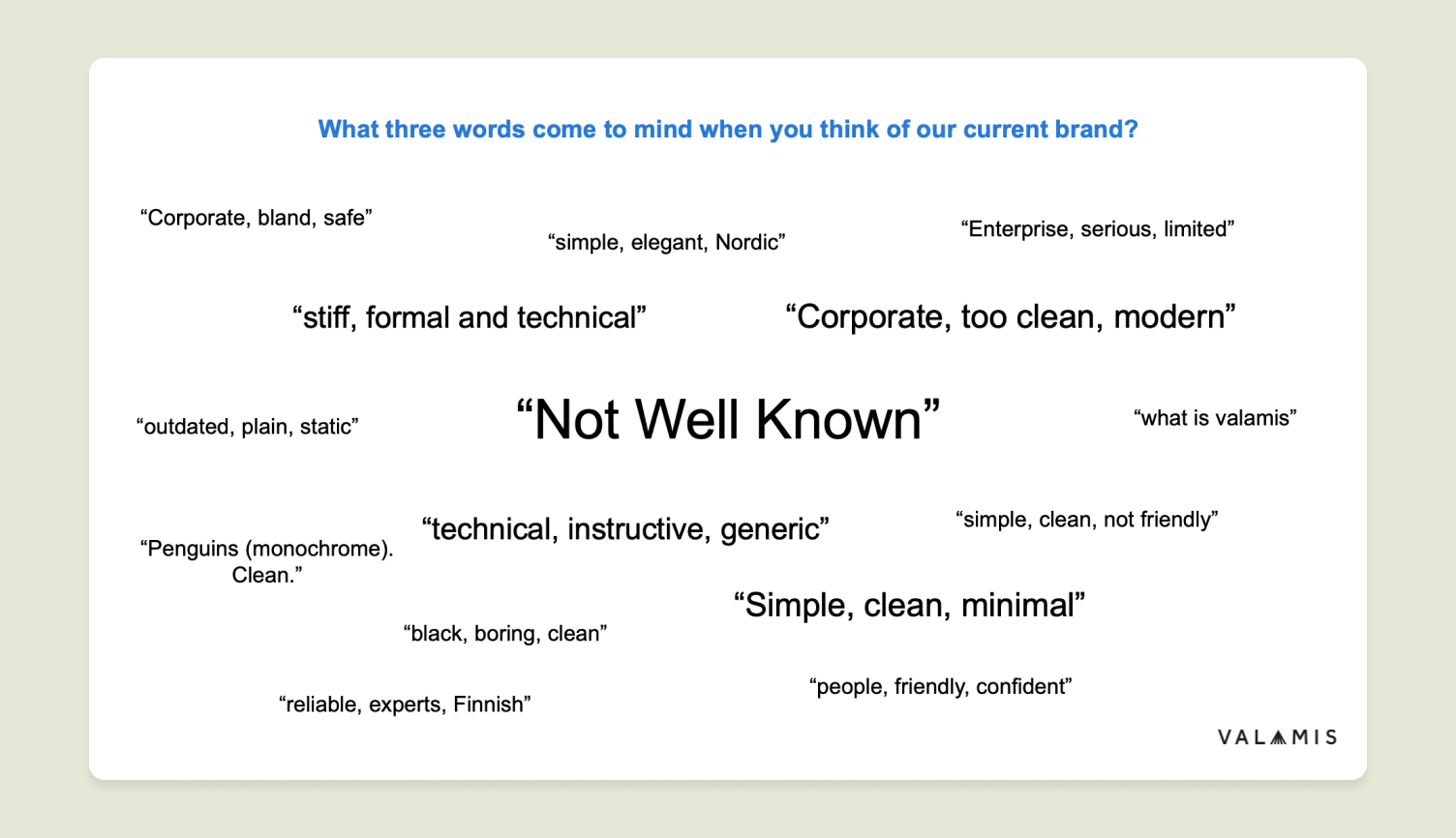
Answers from the 2023 brand survey, before the rebrand.
With that initial thinking, the brand project rolled on.
Through a series of strategic and creative workshops, we crafted an entirely new brand strategy, tone of voice, and visual system for Valamis while retaining the familiar name and logo.
Luckily, we weren’t on this ride alone. We got help from the lovely Verve agency, which searched high and low and guided us home.
We discovered aspects that were missing or undefined. But also plenty of things that were already there, just left unrealized, unspoken, or untapped in the context of our brand.
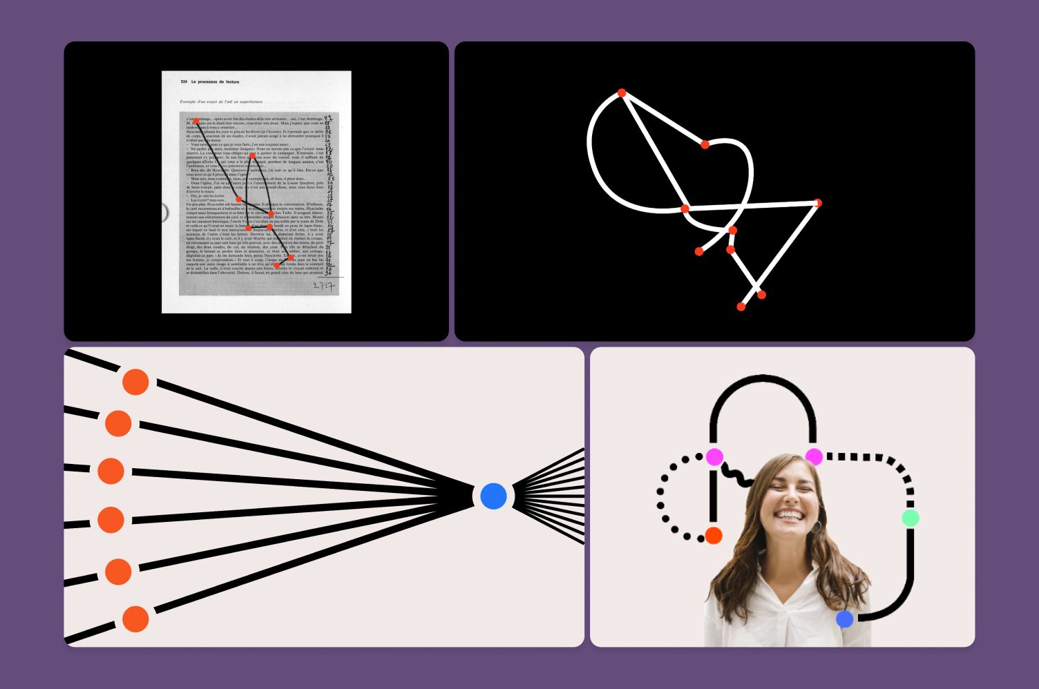
Early drafts of the “Connecting the dots” concept, representing data turning into knowledge but also learning itself. A connection to the Valamis logo can be seen.
For instance, Valamis has always been strong on data. We have developed our own Learning Record Store (LRS) and were the first to adopt the xAPI standard for tracking learning activities. We also have experienced Learning Solution Partners who listen and optimize the platform with customers.
And then there are the customer comments like:
“Valamis feels like a partner, not a tool. We learn from each other to improve the learning experience for all of Valtech’s employees.” – Christian, Group VP of Learning & Development at Valtech
“Valamis wants you to succeed. Their support is what makes the difference.” – Simon, Vice President of Programs at Lambda Chi Alpha
We essentially had the tech, data, and partnership all geared toward understanding what’s important and what works.
So, this notion of giving understanding transformed naturally into the creative idea behind the new brand concept.
The bright, new Valamis
What came out of all that creative brainstorming is simple and playful, yet packed with substance.
I’m proud that it’s not just a fresh layer of paint but communicates a deeper meaning that vibes well with our product vision. We call the concept “connecting the dots.” You’ll see it represented both in our story and visuals.
Essentially, we are talking to all of you responsible for organizational learning, people who may feel their work doesn’t connect with business results.
There may be inefficiencies, silos, complex or overlapping solutions, or simply a lack of time to do anything about it.
You may have struggled to find the right solution among hundreds of options. You may need a more accurate impression of what’s possible with learning or how that can impact your business.
We have faced these questions and more over the past years. It’s time to make better sense of L&D together. Simplify to amplify.
We are about connecting the dots between your business and L&D by building bridges of understanding.
We will show you smarter ways to learn so you can see the big picture of L&D — and contribute to the overall success of your organization.
So, how do we represent these ideas visually? The visual system is built on two primary components.
- Dots. Representing abstract data, something yet to be comprehended or reached.
- Learning paths. Connecting the dots, showing a bigger picture, and turning data into knowledge.

Animation of the Connecting the dots concept.
While highly streamlined, the components fit the story like a glove and enable us to make even an abstract background meaningful. It is saying something instead of just filling a space.
And we selected a bright and energizing color palette to accompany — a massive deviation from our previous corporate approach (monochromatic + blue).
With the fresh new colors, we want to communicate our warm culture better, inspire learning, and add distinction we previously simply didn’t have.
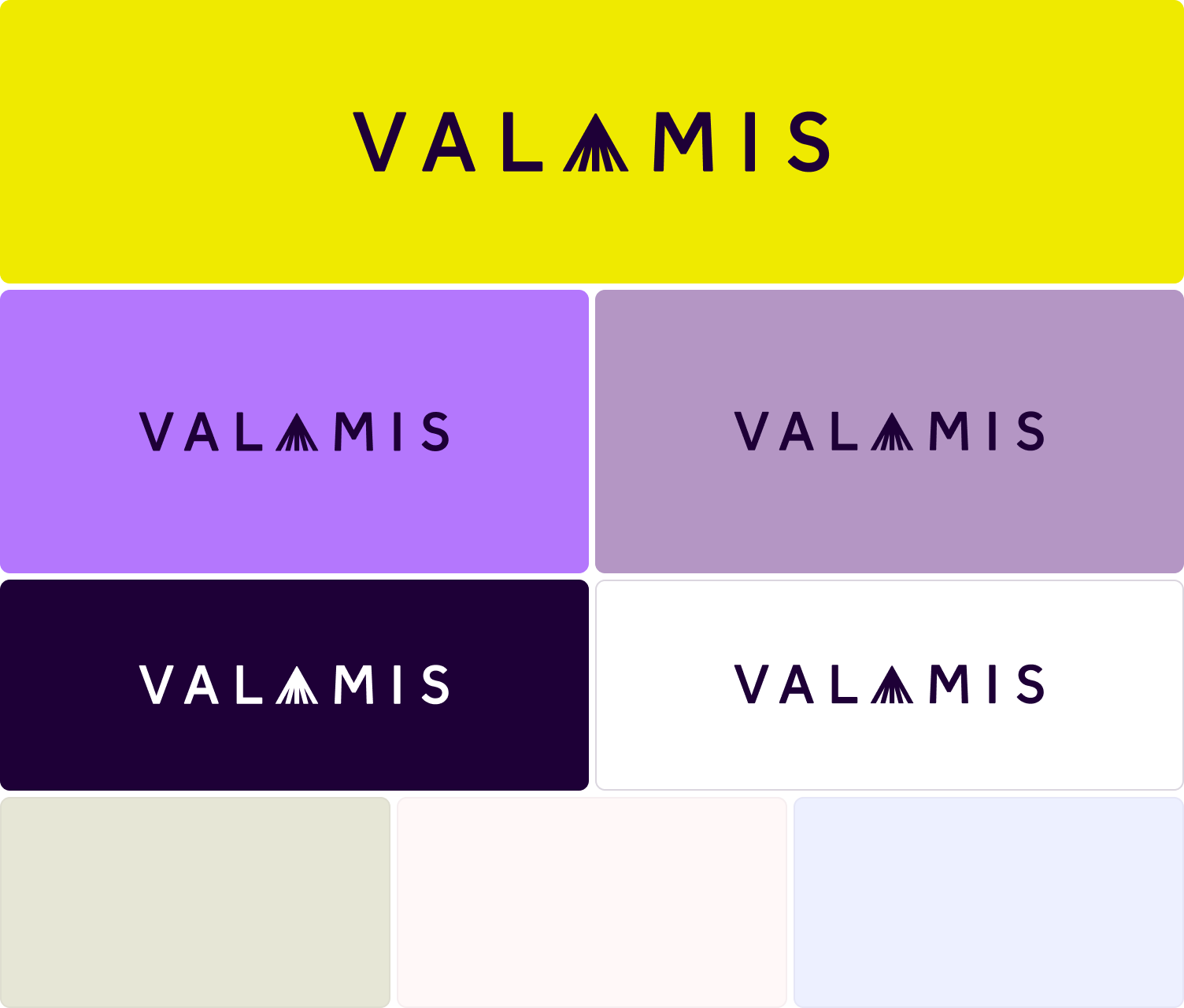
The new Valamis color palette with primary colors of yellow and purple at the top and neutrals at the bottom.
Conclusion
A great brand should be rooted in reality but also carry a higher moral, something to strive for and believe in.
Finding our position and communicating something we could believe in was paramount, and I think we succeeded in reaching those goals.
One of the best moments for me personally was when a person told me our new templates enabled him to create “by far the best-looking deck” at Valamis.
A well-executed brand system encourages everyone to do better and enables pride in their work.
Here are a few lessons I learned throughout the project:
- Consider your values, culture, and product.
Building your story on your foundation is easier than forcing something that’s not you. - Simplify as much as possible.
You always have too much to say and too many ideas to display. Finding clarity is like finding the needle in a haystack, but it pays dividends. - A great idea takes you a long way.
Focusing more on the strategy and story and building a visual style to match ensures that all aspects of the brand speak the same language. - Test with a small group of people throughout the process.
Inviting too many cooks into the kitchen leads to confusion. - Embrace external help.
Sometimes, you are too close to your own work to see the forest from the trees. Choosing a partner with a similar culture makes interaction smoother, even inspiring.
Of course, we still don’t know how the new brand resonates specifically with you. Head to our LinkedIn to join the conversation or jump to our campaign page for more brand related content.
See it in action
Book a demo call now and let us help you connect the dots between learning and business success.
Book a demo now!